Services
Brand Strategy
Brand Identity Design
Package Design
Copywriting

The Challenge
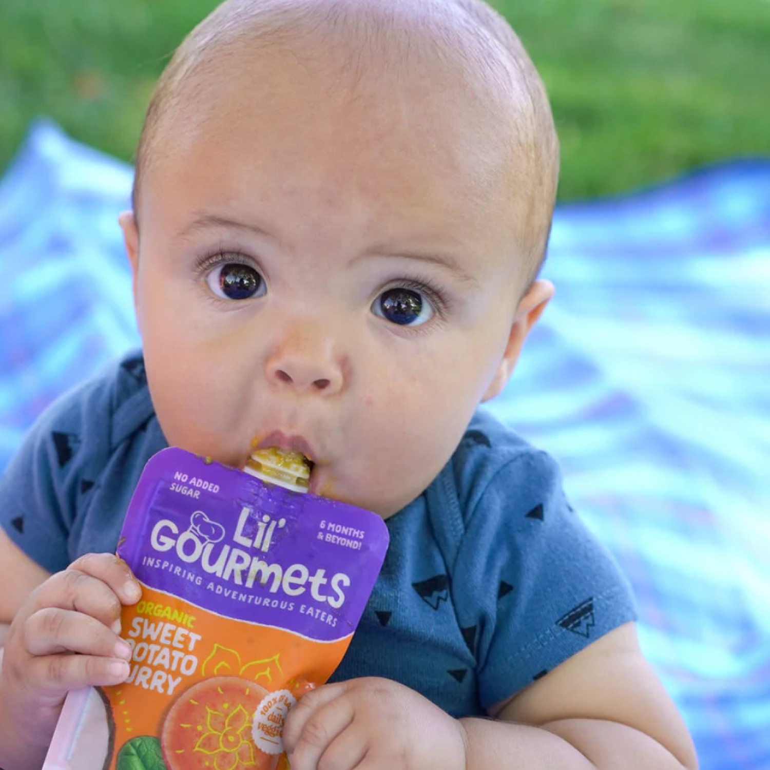
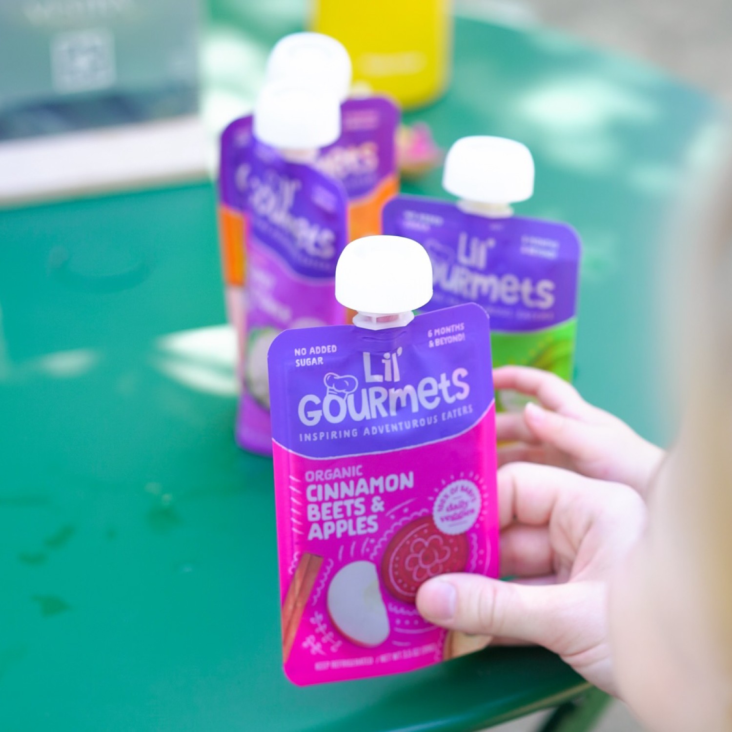
Lil’ Gourmets came to Frooishen at a pivotal time in their brand journey. Known for their fresh, globally inspired, veggie-first baby foods, the brand made the strategic decision to transition from cup packaging to a more convenient squeeze pouch format.
With this change underway, Lil’ Gourmets engaged Frooishen to lead the redesign of their packaging and guide the evolution of their brand identity. Our focus was on preserving existing brand equity while improving communication hierarchy, clarifying their unique value proposition and enhancing visual storytelling to resonate more deeply with both current and new consumers.


Bringing the Updates to life
We aimed to strike a balance between everyday relatability and a sense of discovery.
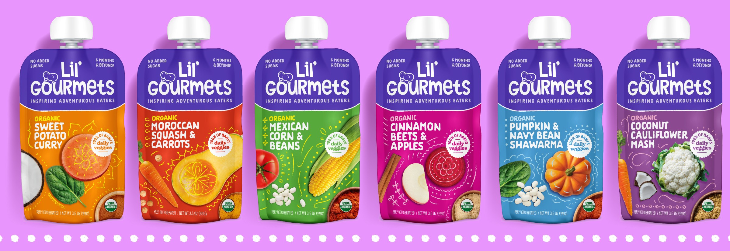
The refreshed logo brings the brand to life, with warmth and meaning. A bold yet approachable purple background now anchors the brand block, aiding visual recognition while delivering a more expressive and emotionally resonant identity. The playful chef’s hat adds a touch of charm and hints at the inspired global flavors behind each recipe.
To emphasize the quality of ingredients, we incorporated a mix of illustration and photography that showcases freshness and transparency. These visuals highlight the real, organic foods inside every pouch—helping parents feel confident in what they’re feeding their little ones. The layered design approach adds richness and depth, reinforcing both trust and emotional connection.
We also refined the communication hierarchy to better resonate with a broader audience. The updated wordmark font lends a strong visual impact while maintaining a kid-friendly, inviting feel. A newly crafted tagline clearly communicates the brand’s core value, while simplified flavor names make it easier for parents to navigate—without losing the cultural references that support the brand’s global story and flavor authenticity.


