REFRESHING AN ICONIC PANTRY FAVORITE

REFRESHING AN ICONIC PANTRY FAVORITE

Services

Brand Strategy

Visual Identity Design

Package Design

Copywriting

Brand World

The Challenge

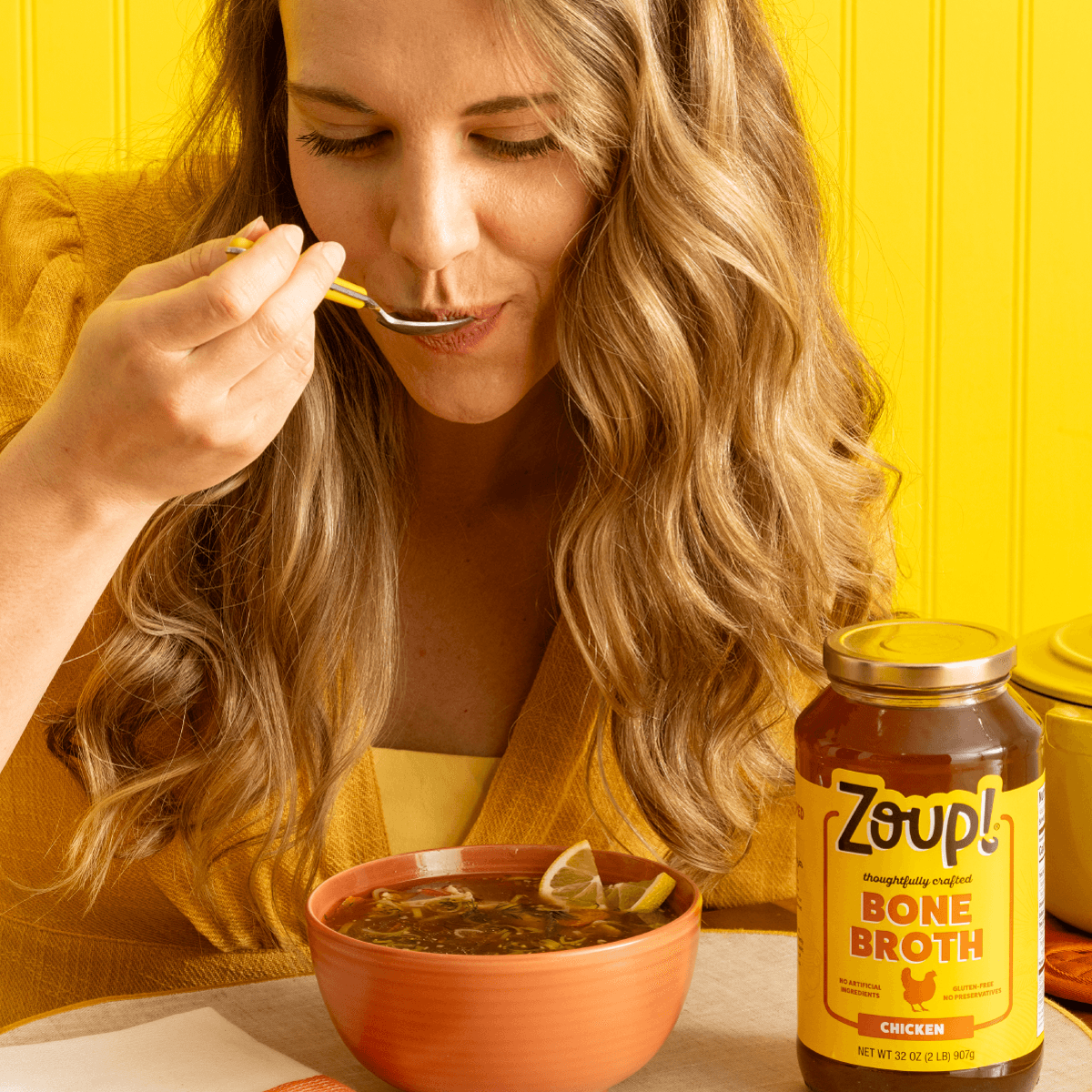
For decades, Zoup! has perfected its broths, soups, and concentrates, drawing on real consumer feedback from its fast-casual restaurant beginnings to craft the best recipes. This dedication has built a loyal following of real soup lovers and a strong retail presence.


To continue growing and reach new customers, Zoup! recognized an opportunity to deepen its connection with consumers and improve shelf recognition. Partnering with Frooishen, we worked collectively to refresh the Zoup! Brand identity and package design, boosting brand visibility, supporting a premium positioning and effectively communicating key attributes.


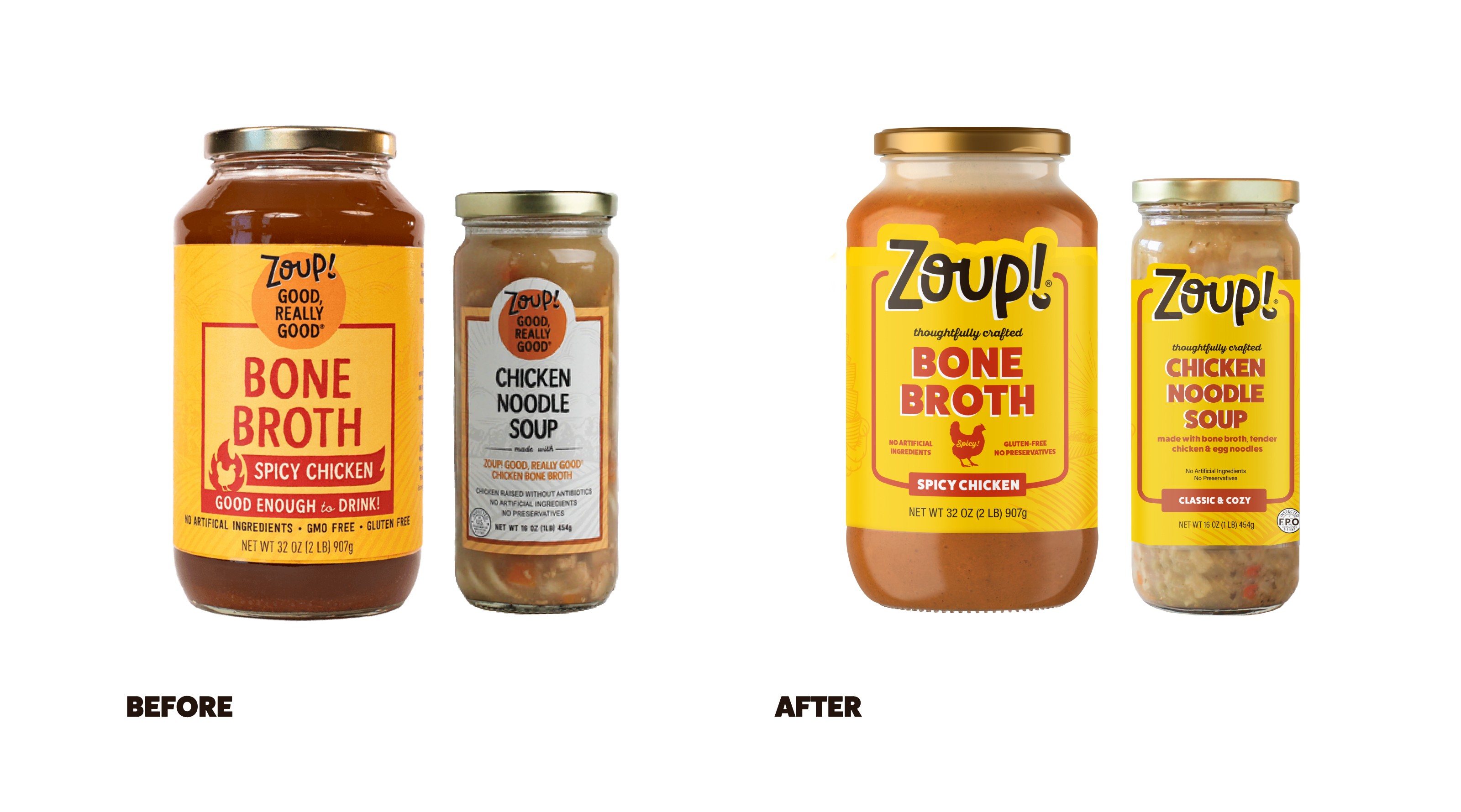
The challenge was balancing the brand's existing equity with the need to evolve. The goal was to refine the visual identity and packaging, preserving key elements that resonated with loyal customers while making the brand more appealing to new buyers.

The Strategy

Our approach focused on reimagining key brand elements—such as the logo, tagline, and overall packaging design—without losing the essence that Zoup! customers already love. This evolution allowed us to present Zoup! as the highest-quality, best-tasting choice in its category while ensuring that its legacy and consumer trust were upheld. Through a thoughtful redesign, we helped enhance Zoup!'s position among the leading premium broth and soup brands and set the stage for its continued success in a competitive marketplace.

Bringing the Updates to Life

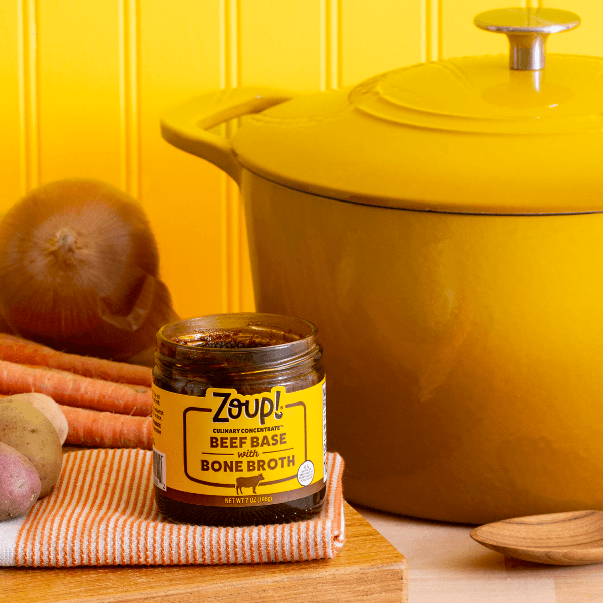
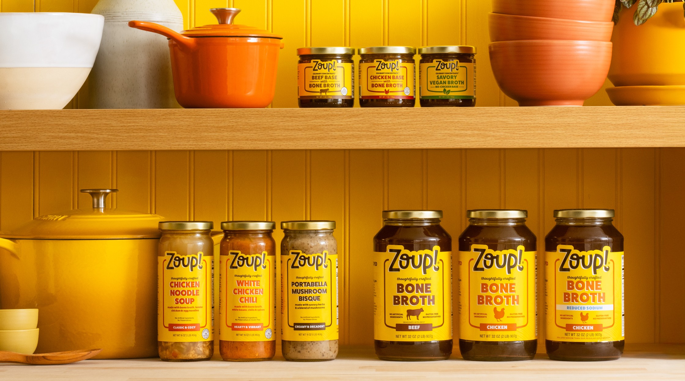
We refreshed Zoup!’s identity and packaging with a vibrant, updated color palette that remained true to the brand's iconic yellow label while enhancing its warmth and energy. The glass jars, a signature packaging element, were preserved to allow the product to shine, but we added a die-cut feature to the top of the label for added visual appeal.


We also refined the messaging, crafting new copy that resonated more with consumers while still incorporating the brand's beloved, time-tested language. The logo was given more prominence, with subtle adjustments to the letterforms to make them feel warmer, more welcoming, and approachable. We updated the fonts to maintain the boldness of the brand while softening the overall look for greater approachability.

The Outcome

While preserving the brand’s established equity, these updates helped Zoup! stand out more prominently on shelf, making it not only recognizable but also more competitive in the marketplace.

The Outcome

While preserving the brand’s established equity, these updates helped Zoup! stand out more prominently on shelf, making it not only recognizable but also more competitive in the marketplace.

LET'S COLLABORATE

Bring Your Brand to Fruition with Frooishen.

SAY HELLO

LET'S

COLLABORATE

Bring Your Brand to Fruition with Frooishen.

SAY HELLO

The Strategy

Starting with a comprehensive brand audit to deeply understand the Don Chilio brand, we evaluated key factors such as demographics, market trends, consumer tensions, competitive landscape, pricing, and brand perception. This foundational work provided a clear understanding of where Don Chilio existed within the marketplace and ultimately how we could evolve the brand to stand out among a competitive and culturally diverse chili market set.

Our next step is where we really brought the heat, developing an ownable Brand Positioning Platform that truly captured the heart of Don Chilio. We identified a major opportunity in positioning the brand as the “chili experts,” a space largely untapped by other Mexican food brands. While many competitors offered a broad range of products, none were focused solely on chilis—a passion that is in the Don Chilio DNA.

Starting with a comprehensive brand audit to deeply understand the Don Chilio brand, we evaluated key factors such as demographics, market trends, consumer tensions, competitive landscape, pricing, and brand perception. This foundational work provided a clear understanding of where Don Chilio existed within the marketplace and ultimately how we could evolve the brand to stand out among a competitive and culturally diverse chili market set.


Our next step is where we really brought the heat, developing an ownable Brand Positioning Platform that truly captured the heart of Don Chilio. We identified a major opportunity in positioning the brand as the “chili experts,” a space largely untapped by other Mexican food brands. While many competitors offered a broad range of products, none were focused solely on chilis—a passion that is in the Don Chilio DNA.

Our approach focused on reimagining key brand elements—such as the logo, tagline, and overall packaging design—without losing the essence that Zoup! customers already love. This evolution allowed us to present Zoup! as the highest-quality, best-tasting choice in its category while ensuring that its legacy and consumer trust were upheld. Through a thoughtful redesign, we helped enhance Zoup!'s position among the leading premium broth and soup brands and set the stage for its continued success in a competitive marketplace.

LET'S COLLABORATE

Bring Your Brand to Fruition with Frooishen.

SAY HELLO